TS-15: User Interfaces
Good design is about clarity over style, and accountability over ego.
– John Maeda
This technical standard covers general best practices for designing and implementing any kind of human-computer interface. These guidelines are not specific to any particular technology or application platform, but cover general principles that apply to all user interfaces.
User interfaces are defined here as any visual or auditory interface that allows either a human user or a programmatic client to interact with a system. User interfaces include graphical user interfaces (GUIs), terminal user interfaces (TUIs), command line interfaces (CLIs), and application programming interfaces (APIs).
Usability is the measure of how effectively, efficiently, and satisfyingly a user can achieve their goals with an interface. It sits within the broader umbrella of user experience (UX), which also covers a user’s emotional response and the value they get from a product beyond the immediate interaction. Usability is measurable — through task success rates, time on task, error rates, and user satisfaction — rather than a purely subjective judgment of whether an interface "feels" easy to use; see Aesthetics and perceived usability for why perceived ease of use and measured usability can diverge.
For the design of URLs, which are part of the user interface of any web-based service, see TS-63.
Design principles
Keep it tidy
Avoid making a user interface cluttered and janky. Keep it tidy, by following these guidelines:
- Eliminate unnecessary animations and transitions that do not add value to the user experience. Occam’s Razor applies here directly: the best way to reduce complexity is to avoid it in the first place, and "tidy" is reached only once no more elements can be removed without compromising function — see Manage choice and complexity for the fuller principle.
- Use whitespace to separate elements and make the interface easier to read and navigate. Every extra unit of information on screen competes with every other unit for the user’s attention and diminishes its visibility, so the goal is not merely to "avoid clutter" but to actively prioritize the content and features that support the user’s primary goals over everything else.
- Use a consistent layout and design language throughout the application. Consistency has two dimensions: internal consistency, within a product or product family, and external consistency, with conventions established elsewhere on the platform or in the industry. Users transfer expectations between similar products (Jakob’s Law — see also Respect conventions and mental models), and inconsistency of either kind raises cognitive load by forcing the user to re-learn something they already thought they knew. Consistency is not a straitjacket, however: it is not a rulebook to be followed uniformly regardless of context. Where a pattern that works is found, share it and talk about the reasons it works, so it can be reused elsewhere; and revisit and improve a pattern when a better way is found or user needs change, rather than preserving it purely for uniformity’s sake.
- Use a grid system to align elements and create a sense of order.
- Use a limited color palette to create a cohesive visual identity.
- Use a single font face, varying only the weight of the text (to add emphasis) and size of the text (to represent hierarchy).
- Use icons to convey meaning and reduce the need for text.
- Use a responsive design to ensure the interface looks good on all devices and screen sizes.
It’s so much easier to read… I just wish you hadn’t added all that whitespace.
– Anonymous user feedback
following a web site redesign
Be careful with colors: they are great as accents, useful for grabbing attention and placing emphasis. But using too many colors gets visually noisy. And colors are not accessible to everyone, so any information represented by color MUST still be accessible without the color. The same caution applies to any single emphasized element more broadly — see the Von Restorff effect in Ordering and emphasis, which warns against relying on color alone, or motion alone, to draw attention.
Accessibility is not a narrow, color-only concern; it is foundational to usable design and applies across the whole interface. Clear headings and action-oriented descriptions help users of assistive technology navigate an interface; carousels and other auto-advancing content are frequently difficult for assistive-technology users to operate, and SHOULD be used with caution or avoided. Responsive design SHOULD be approached mobile-first, designing the constrained case first and progressively enhancing for larger viewports, rather than the reverse. Accessibility testing — with real assistive technology, not automated checks alone — is required to verify equal access, not merely assumed from following guidelines. See TS-18 for detailed, testable WCAG-based accessibility implementation guidance for web interfaces specifically.
Treat accessible design as good design, full stop — not a compliance checkbox layered on afterward. Everything SHOULD be designed to be as inclusive, legible, and readable as possible, and where that requires sacrificing an elegant but narrower solution for a more broadly usable one, make that trade. The people who most need an interface are often the people who find it hardest to use, so design for them from the start, rather than retrofitting accessibility onto a design built for an easier audience — see Understand context for how to ground this in research on real users.
Build trust over time
Good design is not only about optimizing a single moment-to-moment interaction. An interface earns a user’s trust — and a lasting relationship with them — across many interactions over time, not by any one of them in isolation. Reliability across repeated use, honesty about what an action will do before the user commits to it (see TS-18 for the specific requirement that consequential actions be reviewable and confirmable), and consistency (see Keep it tidy, above) all compound: a single polished screen can look usable in isolation while still eroding trust if the product behind it is unpredictable from one visit to the next. Design decisions SHOULD be evaluated for their effect on this longer relationship, not only for how well they perform in a single-session usability test.
Wayfinding and navigation
Wayfinding is how a user builds and uses a mental model of where they are within an interface. It has four components, adapted from Kevin Lynch’s urban-planning theory:
- Orientation — "where am I right now?" A user needs to be able to answer this at any point in the interface.
- Route decisions — "can I find the way to where I want to go?" The interface SHOULD offer a clear path toward the user’s goal.
- Mental mapping — the user builds a coherent model of the interface’s structure well enough to predict where to go next, without having to rediscover the structure on every visit.
- Closure — the user needs confirmation that they have reached their intended destination, not just arrived somewhere.
Support wayfinding with concrete navigation conventions:
- Provide persistent navigation. Links back to the home page and to major sections SHOULD appear on every page, so a user is never left at a dead end. "You are here" markers and breadcrumb trails reinforce orientation by showing the user’s location within the site’s hierarchy and offering a clickable path back through it.
- Support both browse-dominant and search-dominant users. Most users favor one primary navigation style — roughly two-thirds prefer to browse a menu structure first — but the large majority use search at some point too. Provide well-constructed browse navigation and search together, rather than assuming one style for all users.
- Apply the 80/20 principle to prioritize navigation. Roughly 20% of an interface’s features account for 80% of its use. Give that 20% prominent, easy-to-find navigation, and weigh whether the remaining, rarely-used features justify the navigational complexity they add.
Embrace affordances
An affordance is a quality of an object that suggests how it can be used.
In his book The Design of Everyday Things, Dan Norman provides an example of a door handle. Doors you pull should have a nice handle for gripping and yanking, while doors you push should have a flat plate or bar that you can push against. The handle affords pulling, while the bar affords pushing.
Doors that violate these conventions are infuriating to use, because they operate against people’s intuition.
Unlike doors, which are bound by physics, software design affordances are more cultural. We invent them, and sometimes they stick. The more that a person is exposed to different software, the more they will develop awareness about how different types of human-computer interface controls work.
Traditionally, graphical user interfaces have been designed to mimic physical objects. This allows users to apply their knowledge of the physical world to the digital world. A button in a GUI has an affordance that suggests it can be clicked, because it looks like a physical button in the real world. A text input field has an affordance that suggests it can be typed into, because it looks like a box on a paper form.
But sometimes we need to invent new affordances that don’t exist in the physical world. For example, the "pull to refresh" gesture on mobile devices is a relatively new affordance that was invented to solve a new problem (reducing clutter in the GUIs of small-screen devices) and that has been widely adopted because the design proved to be intuitive.
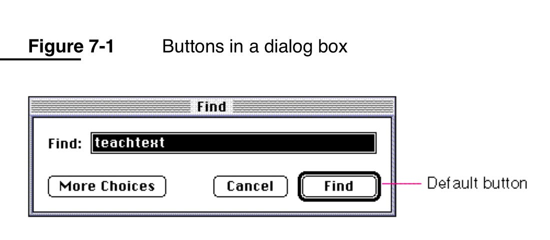
Other long-established software UI affordances include: clickable text is underlined; dialog boxes have a default button that is visually emphasized and is always in the same position; and radio buttons are circular and we can select exactly one in a group, while checkboxes are square and are individually selectable.
Match fidelity to problem resolution
A design artifact’s fidelity — how polished and interactive it is, from a rough sketch to a pixel-perfect, fully-interactive prototype — SHOULD match how resolved the underlying problem already is, not how quickly a high-fidelity version can be produced. Modern prototyping tools, including AI-assisted ones, make it easy to jump straight to a highly polished, interactive prototype before the fundamental questions — what is this screen for, what is the user trying to accomplish, does this flow even make sense — are actually solved. A polished prototype built on an unresolved foundation does not remove the underlying uncertainty; it hides it behind a layer of finish that makes the uncertainty harder to see and more expensive to unwind once stakeholders have started reacting to the visual details instead of the structural ones.
Preserve a low-fidelity phase — sketching, wireframing, rough prototyping — as a deliberate step, not something to skip because a higher-fidelity tool is available. The physical act of sketching by hand engages a different mode of thinking than manipulating a finished-looking interface, and a design problem is often easier to interrogate honestly when it visibly still looks unfinished. Treat raw, tool-assisted generation of a polished interface as execution, distinct from the strategic work — user research, information architecture, flow design — that determines what should be built at all; the two are easy to conflate precisely because a capable generation tool makes execution fast enough to feel like it has answered the strategic question, when it has only skipped past it.
Feedback and communication
Feedback and system status
An interface MUST keep the user informed about what is going on, through timely and appropriate feedback.
- Show that input was received. Every user action — a click, a keystroke, a gesture — SHOULD produce an immediate, perceptible response, even if the underlying operation takes longer to complete.
- Communicate progress on long operations. Where an operation cannot complete within the response-time thresholds set out below, the interface MUST show a progress indicator. A determinate indicator (a percentage or a progress bar) is preferable where the remaining duration is known; an indeterminate indicator (a spinner) is acceptable where it is not.
- Reflect the true system state. Feedback MUST NOT claim an operation succeeded before it has. A false positive — e.g. clearing a form before its submission is confirmed — erodes trust in every subsequent status message.
Response-time thresholds, established by decades of human-computer interaction research, govern how feedback should be designed:
Threshold | Effect |
|---|---|
100 ms | The interface feels instantaneous. No feedback beyond the result itself is needed. Below this threshold, users interact conversationally: they issue a query or command, see the result, and immediately refine it, entering a tight loop of iteration rather than a single request-response exchange. |
400 ms | The Doherty Threshold. Below this, user and system maintain a productive pace of interaction; productivity measurably improves as response time approaches it from above. A perceived-performance technique — for example, optimistic UI updates, or a progress indicator that starts immediately — elps close the gap when a genuine sub-400ms response is not achievable. |
1 s | The threshold beyond which users notice the delay and their flow of thought is interrupted, even though they still perceive the operation as part of a continuous task. A progress indicator becomes necessary above this threshold. |
10 s | The threshold beyond which users lose focus on the task entirely. An operation that can take this long MUST show a determinate progress indicator and SHOULD allow the user to cancel or continue working on something else while it completes. |
Performance is not merely a satisfaction metric — it changes how users use an interface. A tool that responds within the 100 ms instantaneous threshold invites interactive, iterative use: the user issues a query, inspects the result, and refines it in a tight loop, in the same way a search-as-you-type field is used differently from a search form with a submit button. A slow tool is used differently, and less often, than a fast one solving the same problem — users route around latency by choosing a faster path when one exists, even at the cost of accuracy or completeness. Design decisions that add latency SHOULD be weighed against this effect, not only against the raw time cost.
Flow — a state of immersed, energized focus on a task — is sustained by removing friction from the interaction, by giving feedback on what the user has done and accomplished so far, and by making relevant content and actions discoverable without requiring the user to break focus to search for them. An interface that interrupts flow with unnecessary confirmation dialogs, buries the next likely action, or fails to acknowledge progress works against the user’s ability to sustain concentration.
Speak the user’s language
An interface MUST speak the user’s language, with words, phrases, and concepts familiar to the user, rather than system-oriented terms internal to the implementation.
- Use words the user already knows. Avoid technical jargon, internal system terminology, and implementation-specific vocabulary in favor of terms the target audience uses in their own domain.
- Follow real-world conventions. Where a real-world or industry convention exists — a checkout flow that mirrors a physical till, a calendar that mirrors a paper diary — the interface SHOULD follow it rather than invent an unfamiliar alternative.
- Present information in a natural, logical order. Sequence steps, fields, and content in the order the user’s own mental model of the task expects, not the order that is most convenient for the underlying data model or implementation.
User control and freedom
Users make mistakes, and change their minds. An interface MUST give them a clearly marked way out of an unwanted state.
- Provide an emergency exit. Every flow — a multi-step wizard, a modal dialog, a nested menu — MUST offer an obvious way to leave it without completing it: a Cancel button, a close control, or support for the browser/OS back gesture.
- Support Undo. Where an action has a consequence the user might not have intended, the interface SHOULD offer Undo, either as an immediate action (e.g. a toast notification with an "Undo" affordance) or as a persistent capability (e.g. version history).
- Support Redo, where Undo exists. If a user backs out of an Undo by mistake, Redo lets them recover without repeating the original action.
Undo and Redo are two of the many affordances a well-designed interface provides — see Embrace affordances for the general concept.
Errors
Error prevention
Good design prevents errors before they happen, rather than relying on good error messages to recover from them.
- Eliminate error-prone conditions. Where a class of error can be designed out of existence — disabling a submit button until a form is valid, offering only valid date ranges in a picker — prefer that over detecting the error after the fact.
- Distinguish slips from mistakes. A slip is an unconscious action performed incorrectly, despite the user having the right intention — a mis-click, a typo. A mistake is a conscious action based on an incorrect intention — the user genuinely wanted the wrong outcome. Slips are prevented with better affordances and confirmation on destructive actions; mistakes are prevented with clearer information at the point of decision.
- Use constraints and good defaults. Constrain input to valid values where practical (a dropdown instead of free text for a fixed set of options), and pre-select the default a majority of users need.
- Confirm before consequential actions. Where an action cannot be designed out of the possibility of error, present a confirmation step before it is committed, particularly where the action is destructive or difficult to reverse.
Error messages
Where an error cannot be prevented, the interface MUST help the user recognize, diagnose, and recover from it.
- Use plain language. State the problem in words the user understands. MUST NOT surface a bare error code or a stack trace as the primary message.
- Be precise. Identify exactly what went wrong — which field, which step, which constraint was violated — rather than a generic failure message.
- Suggest a solution. Where possible, tell the user what to do next, not only what went wrong.
- Use a recognizable visual treatment. Errors SHOULD be styled consistently (color, icon, placement) so users learn to recognize an error message on sight.
- Give every message a consistent structure. Two structures work well: explain the problem then instruct the user what to do (Explain, then Instruct), or apologize, explain, then resolve (Apologize, Explain, Resolve) for more severe errors. Pick one structure and apply it consistently across the interface.
- Write in active voice. "You must enter an email address," not "An email address must be entered."
- Trim unnecessary politeness. Avoid opening every message with "Please" — it adds length without adding clarity, and a form full of "please" messages reads as noise.
- Do not blame the user. Describe the situation, not the user’s failing: "The password and confirmation don’t match," not "You typed the password wrong."
- Vary tone by severity. A minor, easily-corrected error (a missing form field) can use a casual, light tone. A severe error (data loss, a failed payment) SHOULD use a sincere, direct tone. See Voice and tone for how tone relates to the interface’s overall voice.
- Enumerate and group by cause. Where an interaction can fail for several distinct reasons, group the error messages by cause and rank them by severity, so the most consequential problem is addressed first.
Memory and cognitive load
Recognition over recall
An interface MUST minimize the user’s memory load. Keep elements, actions, and options visible and easily retrievable, rather than requiring the user to remember information from one part of the interface to use it in another.
Working memory holds only around four to seven "chunks" of information at a time, and that information fades within twenty to thirty seconds unless it is rehearsed. Practical consequences:
- Show, don’t ask the user to remember. Keep information the user needs visible on screen — a running total, a selected filter, a previously entered value — rather than requiring them to hold it in memory while they navigate elsewhere.
- Differentiate visited links. A visited-link style lets a user recognize where they have already been, rather than requiring them to remember it.
- Carry critical information across screens. Where a decision on one screen depends on information from another (e.g. comparing prices across a multi-step flow), surface that information again — a comparison table, a persistent summary panel — rather than relying on the user’s memory of an earlier screen.
- Organize content into chunks. Group related items so users can process them as a handful of meaningful chunks rather than a long undifferentiated list. Miller’s Law (the "magical number seven, plus or minus two") is commonly cited as a working-memory limit, but MUST NOT be used to justify an arbitrary limit on the number of items in an unrelated context — for example, forcing a navigation menu to exactly seven items when the content naturally has more or fewer.
Cognitive load comes in two forms. Intrinsic load is inherent to the task itself and cannot be removed without changing the task. Extraneous load is added by the interface — unnecessary decorative elements, inconsistent patterns, distracting animation — and CAN and SHOULD be removed. Every element added to an interface competes with every other element for the user’s limited attention; see Keep it tidy for the related minimalism guidance.
Flexibility and efficiency of use
An interface SHOULD serve both the novice, encountering it for the first time, and the expert, who uses it repeatedly and wants speed.
- Provide accelerators for experienced users. Keyboard shortcuts, gestures, and other accelerators can speed up interaction for experienced users without being visible to, or getting in the way of, novice users.
- Support multiple paths to the same outcome. Where practical, let a task be completed in more than one way — a keyboard shortcut alongside a menu item, a search box alongside browsable navigation — so users can choose the path that fits their familiarity and context.
- Allow personalization and customization. Letting users tailor frequent actions, layouts, or defaults to their own workflow serves both inexperienced users (who can ignore the customization surface entirely) and experienced users (who use it to work faster).
Help and documentation
Even a well-designed interface may need supporting documentation. Users tend to skip manuals and start using software immediately, so:
- Make help easy to search. Documentation SHOULD be searchable, not only browsable as a linear document.
- Focus on the user’s task. Structure documentation and in-context help around what the user is trying to accomplish, not around the internal structure of the system.
- Keep it concise, and list concrete steps. Favor short, actionable instructions over long prose explanations.
- Present help in context, where it is needed. A tooltip, an inline hint, or a contextual link to fuller documentation, placed at the point of need, reaches users who would never open a manual — regardless of the path they took to get there.
See TS-25 and TS-26 for how to structure and write documentation itself; this section covers only where and how it should surface within an interface.
Respect conventions and mental models
Users prefer an interface that works like others they already know. They transfer expectations between similar products, so breaking an established convention without good reason costs more than it might seem to.
- Follow platform and industry conventions. Where a convention is well-established — the shopping-cart icon, the hamburger menu, pull-to- refresh — following it lets users transfer existing knowledge to the new interface at no cost.
- Minimize deviation from convention. Departing from a convention SHOULD be a deliberate choice with a clear reason, not an incidental result of not knowing the convention exists.
- Bridge intentional changes. Where an established interface changes a convention its existing users rely on, offer a transition — a "what’s new" tour, a temporary toggle back to the familiar version — rather than switching without warning.
- Design to match users' mental models. A user’s mental model is their internal understanding of how the system works, built from prior experience with similar systems. The closer the interface matches that model, the less the user has to learn. User research — interviews, personas, journey maps, empathy maps — narrows the gap between the designer’s model of the system and the user’s model of it; see Understand context for more on grounding design decisions in research about real users.
This section covers consistency with the outside world. For consistency within an interface, see Keep it tidy and the note on when to diverge from uniformity, below.
Choice and complexity
Manage choice and complexity
More choices and more complexity slow users down and degrade the quality of their decisions. Manage both deliberately, rather than letting them accumulate as features are added.
- Minimize choices where response time is critical. Decision time grows with the number and complexity of the choices offered — Hick’s Law. Where a fast decision matters, reduce the option set rather than presenting everything at once.
- Break complex tasks into smaller steps. A multi-step wizard with a small number of choices per step is easier to complete correctly than a single screen presenting every choice at once.
- Highlight recommended options. Where one option is right for most users, mark it as the recommended or default choice, rather than presenting a flat list of equally-weighted alternatives.
- Use progressive onboarding. Introduce complexity gradually as a new user becomes familiar with an interface, rather than presenting its full capability on first use. Avoid over-abstracting the choices themselves in the process — reducing five specific options to one vague one does not reduce complexity, it hides it.
- Prevent choice overload. Too many options overwhelm users and degrade decision-making, even when more choice is nominally better. Mitigate with side-by-side comparison of a small number of leading options, prioritized or featured content, and up-front search and filtering that narrows a large set before the user has to evaluate it item by item.
- Absorb complexity rather than pushing it onto the user. Every process has an irreducible core complexity — the conservation of complexity, or Tesler’s Law — that must be handled somewhere, by either the system or the user. A well-designed interface absorbs as much of that burden as it can, rather than exposing every configuration option and letting the user assemble the outcome themselves. Do not design for an idealized, fully rational user who will read every option carefully; design for the distracted, time-pressured user who will not.
- Prefer the simplest solution that works. Occam’s Razor: among competing designs that solve the problem equally well, prefer the simplest. Reduce complexity by removing elements, not by adding explanatory text to justify keeping them — completion is reached only when no more can be removed without compromising function. This overlaps with, but is distinct from, the general tidiness guidance in Keep it tidy: Occam’s Razor is a test applied when choosing between designs, not a standing instruction to avoid clutter.
Targeting and reachability
The time it takes a user to acquire an on-screen target — to move a pointer to a button, or a thumb to a touch target — is a function of the distance to the target and its size (Fitts’s Law).
- Make targets large enough. A touch target MUST be large enough to hit reliably; a small target forces slow, careful movement or produces mis-taps.
- Space targets apart. Adjacent targets MUST have enough space between them that acquiring one does not risk activating its neighbor.
- Place frequent actions near the user’s attention. A primary action placed close to where the user is already looking — near the content it acts on, rather than in a distant toolbar — is faster and less error-prone to reach.
- Expect errors when targets are small and movements are fast. A UI that demands rapid interaction with small targets — a fast-scrolling list of small icon buttons, for example — will produce more mis-taps than one that is either slower-paced or more generously sized. Where both cannot be avoided, favor the larger target.
Visual perception
Aesthetics and perceived usability
Users perceive an aesthetically pleasing design as more usable, independent of whether it actually is. This is the Aesthetic-Usability Effect, and it cuts both ways:
- An attractive design earns more tolerance for minor usability issues — users are more forgiving of small friction in an interface they find visually pleasing.
- Visually pleasing design can mask real usability problems during testing — test participants report a design as easier to use than their actual task performance shows. Usability testing MUST NOT rely on subjective satisfaction ratings alone; measure task success and time-on-task alongside them.
Aesthetic quality is not a substitute for usability, but it is not a frivolous concern either — it measurably changes how forgiving users are of the friction that remains.
Ordering and emphasis
Where content appears in a sequence, and which items stand out, are design decisions with predictable effects on what users notice and remember.
- Place key actions at the ends of a sequence. Users best remember the first and last items in a series — the serial-position effect, comprising a primacy effect (first items) and a recency effect (last items). Place the most important actions at the far left and right of a navigation bar or action list, and least important items in the middle.
- Make the important item visually distinctive — with restraint. The visually distinctive item in a group is the one users remember (the Von Restorff, or isolation, effect). Use this to draw attention to a key action or piece of information, but exercise restraint: if too many items compete for distinctiveness, none of them stand out, and an emphasized item that looks too much like an advertisement gets ignored on sight (see banner blindness, below). Emphasis MUST NOT rely on color alone — color-vision deficiency affects a meaningful share of users — or on motion alone, which is inaccessible to users sensitive to motion; see TS-18 for
prefers-reduced-motionand other web-specific accessibility implementation guidance. - Counter banner blindness. Users learn to filter out content that looks like an advertisement, regardless of its actual relevance. Avoid layouts, placements, and visual treatments that make genuinely important content resemble an ad.
- Counter change blindness. A significant change to the interface can go unnoticed if it is not accompanied by a strong perceptual cue — an animation, a highlight, a notification. Do not rely on the user noticing a silent change of state.
Grouping and structure
Gestalt psychology describes several principles for how users perceive visual structure — which elements read as related, and which as separate — before they consciously analyze the layout at all.
- Common region. Elements enclosed by a shared border or background are perceived as a group, even without proximity. Use a card, a panel, or a shaded background to group related controls or content.
- Proximity. Elements placed near each other are perceived as related. Spacing is itself a grouping signal: the gap between two groups SHOULD be visibly larger than the gap between elements within a group.
- Prägnanz. Ambiguous or complex shapes tend to be perceived in their simplest possible form. A cluttered or irregular layout works against this tendency and reads as harder to parse than a clean, regular one.
- Similarity. Visually similar elements are perceived as related, even when they are not adjacent. This cuts both ways: use consistent styling to signal that elements serve the same purpose, and keep functionally different elements visually distinct — for example, a hyperlink styled identically to plain body text loses its similarity-based signal that it is clickable.
- Uniform connectedness. Elements that are visually connected — by a line, a shared color, a continuous shape — are perceived as more related than elements that are merely close together or similar in appearance. This is a stronger grouping signal than proximity or similarity alone.
Motivation and pacing
Progress and completion
Visible progress toward a goal motivates users to complete a task, even where the progress shown is not strictly necessary to the outcome.
- Show progress toward completion. A progress bar, a step counter ("Step 2 of 4"), or a completeness meter increases the likelihood a user finishes a multi-step task, compared to no indication of how much remains.
- Artificial progress still motivates. Progress that is partly pre-filled at the start of a task (the goal-gradient effect) — crediting the user with early progress rather than starting a meter at zero — measurably increases completion rates, provided it is not misleading about genuine remaining effort.
- Signpost incomplete content. People remember unfinished tasks more vividly than finished ones (the Zeigarnik effect). A clear signifier of additional or incomplete content — a badge, a partially-visible next section, an unread count — invites the user to continue or discover more.
Experience peaks and endings
Users judge an experience by its most intense moment and by how it ends, not by the average quality of every moment within it (the peak-end rule). They also recall negative experiences more vividly than positive ones.
- Design the peak deliberately. Identify the point of highest emotional intensity in a flow — a successful purchase, an error, a completion screen — and make sure it reflects well on the product, since it will disproportionately shape how the whole experience is remembered.
- Design the ending deliberately. The last impression a user has of an interaction — a confirmation screen, a closing message, a sign-off email — carries more weight than its brevity suggests.
- Design recovery from low points. Where an interaction includes a negative moment (an error, a delay, a failed action), the recovery from it matters more than the negative moment itself did. A well-handled recovery can offset the memory of the problem that caused it.
Task duration and pacing
Work expands to fill the time available for it (Parkinson’s Law). Applied to interface design:
- Set expectations for task duration. Where a task has a natural, bounded scope — filling in a short form, confirming a purchase — the interface SHOULD be designed so completing it does not take longer than the user’s expectation, rather than allowing the process to sprawl.
- Use autofill to prevent task inflation. Pre-filling known information — from browser autofill, from account data, from a previous step in the same flow — prevents a task from expanding to include re-entering information the system already has.
Prioritization
Roughly eighty percent of outcomes come from around twenty percent of causes (the Pareto Principle). Applied to interface design, this means concentrating design and engineering effort on the areas that bring the largest benefit to the most users, rather than distributing effort evenly across every feature or edge case. This is a prioritization heuristic, not a precise ratio — the point is that effort and impact are rarely evenly distributed, and design decisions SHOULD account for that.
Inputs, context, and bias
Tolerance of input
Postel’s Law — "be liberal in what you accept, conservative in what you send" — applies as much to a user interface as it does to a network protocol.
- Anticipate variable input. Accept the range of formats a user is likely to enter (a phone number with or without spaces or a country code, a date in more than one common format) rather than demanding one exact form.
- Define boundaries clearly. Where input genuinely cannot be accepted outside a range, state the boundary explicitly, up front, rather than letting the user discover it via a rejected submission.
- Give clear feedback when input is normalized or rejected. Where the interface accepts a loose input and normalizes it, show the user the normalized value, so they can confirm it was interpreted correctly. Where input must be rejected, explain why — see Error messages.
This principle applies equally to graphical interfaces and to APIs — a programmatic client benefits from tolerant request parsing and precise response formatting in the same way a human user benefits from tolerant form input.
Bias awareness
Designers are subject to the same cognitive biases as the users they design for, and those biases can silently distort a design’s outcome.
- Watch for confirmation bias. A designer who has already decided what the "right" answer is tends to notice evidence that supports it and discount evidence against it, including during user testing. Structure research and testing to actively look for disconfirming evidence, not only confirming evidence.
- Watch for unintentional discrimination. A design built around the designer’s own habits, abilities, and context of use can systematically exclude users whose habits, abilities, or context differ — see Understand context. Awareness of common cognitive biases helps a designer recognize when a decision is being driven by an unexamined assumption rather than by evidence about real users.
Understand context
Design for the person, not for the screen. A user’s context of use shapes what a good design looks like as much as their device does:
- Where the user is. A public library, a noisy commute, a workplace with restricted network access — the physical and social environment changes what an interface can reasonably ask of a user.
- What device the user has. Screen size is only one dimension of device context; also consider processing power, network reliability, and input method (touch, keyboard, voice).
- The user’s prior familiarity. A user who is only really familiar with one or two other products brings that experience — and only that experience — to a new interface; do not assume broader technical fluency than the evidence supports. This includes users encountering the web, or a category of product, for the first time.
Understanding context of use requires research, not assumption: user interviews, personas, journey maps, and empathy maps are the standard tools for narrowing the gap between the designer’s mental model and the real diversity of users' situations — see Respect conventions and mental models. Accessible design is good design, not a separate concern layered on afterward: everything SHOULD be designed to be as inclusive, legible, and readable as possible, even where that means sacrificing an elegant but narrower solution. The people who most need an interface are often the people who find it hardest to use, so their needs SHOULD be considered from the start of the design process, not retrofitted once a design aimed at an easier audience is already built.
API design principles
An application’s API is its developer-facing user interface — the developer consuming it is the "user" these design principles serve, in the same sense as the person using a GUI. An API SHOULD be evaluated for utility, simplicity, and elegance in the same way a graphical interface is evaluated for usability.
- Keep the barrier to entry low. A new consumer SHOULD be able to make a first successful call with minimal setup and minimal reading. Simplicity is a usability property of an API in the same way it is a usability property of a GUI — see Keep it tidy.
- Do not trade the single-responsibility principle for simplicity. An API that looks simple because one method does many unrelated jobs is not actually simple — it has moved complexity from the surface into the method’s internal branching, at the cost of higher cyclomatic complexity and harder testing and maintenance. A widely-cited cautionary example is jQuery’s
$function, which was simultaneously a selector, a DOM-ready callback registrar, and an element-creation function — one entry point doing several unrelated jobs, discoverable only by reading its documentation rather than by its own shape. - Do not repurpose one method as both getter and setter. Reading a value and mutating it are fundamentally different actions and SHOULD have distinct names, rather than overloading a single method’s behavior on whether an argument is passed (e.g.
.height(50)to set,.height()to get). Where the target language supports property syntax with distinct getter and setter functions, prefer it — it makes the mutation explicit at the call site, rather than implicit in which arguments were passed.
For the design of HTTP-specific API surfaces — resource modeling, status codes, versioning, pagination — see TS-21. This section covers general API usability principles that apply regardless of transport or protocol.
Visual rhythm and text
Spacing and rhythm
A predefined spacing scale — a fixed set of values (e.g. 4px, 8px, 16px, 32px) rather than arbitrary pixel values chosen per element — creates visual consistency and gives designers and developers a shared vocabulary for describing layout.
- Define a spacing scale, and use only its values. An interface’s margins, padding, and gaps SHOULD be drawn from a small, predefined set of spacing values, not chosen ad hoc per component.
- Reserve spacing units for space between elements, not element size. A spacing scale governs the gaps between things — margin, padding, gutters — not the dimensions of the things themselves.
- Flex spacing at breakpoints. A spacing value appropriate at desktop width may be too generous on a small screen; the scale SHOULD adjust at responsive breakpoints rather than staying fixed across all viewport sizes.
- Keep exception units local. Where a component genuinely needs a spacing value outside the standard scale, scope that exception to the component itself rather than adding it to the shared scale, which should stay small and predictable.
Typography
- Limit an interface to two typefaces. A conventional pairing combines one serif and one sans-serif face — e.g. a serif for body text and a sans-serif for headings — chosen for legibility and proven screen performance rather than decorative appeal. Where a single typeface family is used throughout, vary its weight and size for contrast instead of introducing a second face; account for the fact that different typefaces at the same nominal size can have noticeably different x-heights, and compare them at actual rendered size before pairing.
- Left-align text. A left-aligned block has an even left margin the eye can track down the page and an irregular right margin that costs nothing to read. Avoid justified text on the web: browsers cannot reproduce print-grade justification spacing, and the result reads as uneven gaps between words. Avoid centered and right-aligned body text for the same reason in reverse — the eye has no fixed margin to anchor its scan.
- Vary one emphasis parameter at a time. Emphasize text by changing size, weight, or spacing — not several at once. Emphasizing everything leaves nothing standing out. Do not use underlining or colored text for anything that is not a link: both visually read as a hyperlink and mislead the user who tries to click non-interactive text.
- Use generous leading for screen reading. Line spacing on screen SHOULD be more generous than the equivalent print convention, to compensate for lower screen reading fidelity. Define leading in relative units (
emor%) rather than a fixed pixel value, so it scales with the text.
Microcopy and UI text
Short interface text — labels, button text, status messages, tooltips — is a different register from the longer-form documentation prose covered by TS-26. It follows its own, tighter conventions:
- Titles and short messages take no terminal full stop. A button label, a heading, or a one-line status message SHOULD NOT end with a period.
- Use hyphens for readability in short messages. Where a short message needs to link related words, a hyphen keeps it scannable at a glance.
- Write longer descriptions as full prose. Once a piece of UI text runs to more than one sentence — a longer help message, an error explanation with multiple clauses — write it as ordinary prose, with terminal full stops, following the general writing conventions in TS-26.
See Error messages for the specific conventions that apply to error text.
Voice and tone
An interface’s voice is its consistent personality — the vocabulary, sentence rhythm, and level of formality that stay the same regardless of what is being communicated. Its tone is how that voice adapts to a given situation. Voice stays constant; tone shifts.
- Keep voice consistent. Every piece of interface text — labels, buttons, errors, marketing copy — SHOULD read as though it came from the same source, with the same personality.
- Vary tone by situation. A minor, easily-corrected issue can be communicated in a casual, warm tone. A severe issue — data loss, a failed payment, an account-security event — SHOULD use a sincere, direct tone. Mismatching tone to severity (a jokey message for a serious failure, or an alarmed one for a trivial notice) undermines trust in the interface’s other messages. See Error messages for how this applies specifically to errors.
Designing AI experiences
An interface that incorporates AI-generated or AI-assisted output introduces failure modes that the design principles above do not, on their own, cover: the output can be plausible-sounding and wrong, and its behavior is probabilistic rather than deterministic, so the same input will not always produce the same result.
- Make AI involvement clear. Where content, a suggestion, or an action was produced or assisted by AI rather than a deterministic system or a human, say so. A user who cannot tell which they are looking at cannot calibrate how much to trust it.
- Design for confident wrongness. Unlike a traditional error state, a wrong AI output usually looks the same as a correct one — there is no broken layout or error message to signal the failure. Surface the model’s own confidence where it is available, make the output easy to verify against a source, and make correcting or dismissing a wrong output at least as easy as accepting a right one.
- Keep a human able to intervene. For any consequential action an AI feature can take or suggest, give the user a clear point to review, edit, or reject it before it takes effect — consistent with the general confirm-before-consequential-action requirement in TS-18. Do not let an AI feature silently take an action a user did not explicitly request or approve.
- Treat latency and failure as a first-class part of the interaction. An AI feature’s response time is often both slower and less predictable than a conventional request, and it can fail in ways a conventional feature cannot (a nonsensical result, a partial or truncated one). Design an explicit waiting state — see Feedback and system status — and a graceful degraded state for when the AI feature is unavailable or its output must be discarded, rather than leaving the interface in an unexplained stuck state.
User research
Design decisions grounded in evidence about real users produce better interfaces than decisions grounded in the designer’s own intuition alone — see Understand context and Bias awareness. This section covers the research process itself, at the level of detail relevant to a designer or engineer running it, not a full research-methods reference; see TS-12 for how usability testing fits into a project’s wider testing and quality process.
Planning and conducting research
- Write a research plan before recruiting participants. State the research question, the method chosen to answer it, who will be recruited and how many, and how success will be judged. A plan agreed up front keeps a study focused on the question it set out to answer, rather than drifting during the session itself.
- Structure a usability test around realistic tasks, not a guided tour of the interface. Give the participant a goal to accomplish and observe where they struggle, rather than asking them to narrate their opinion of the design. Note both where participants fail to complete a task and where they succeed but take an unexpected or inefficient path.
- Structure an interview around key moments, with a script and example questions for each, rather than an unstructured conversation — this keeps multiple interviews comparable to each other. Immediately after each interview or test session, hold a debrief: capture first impressions, surprising findings, and points of disagreement between observers while they are still fresh, before moving to formal analysis.
- Secure informed consent from every research participant before a session begins, using a clear participant agreement that explains what will be recorded, how the data will be used, and that participation is voluntary and can be withdrawn at any time.
Personas
A persona is a synthesized profile representing a group of real users with shared goals and behavior, built from research rather than invented from assumption. Personas help a design team keep a consistent, shared mental model of who they are designing for, across a project with many contributors — see Understand context.
Build personas that reflect the actual diversity of an interface’s audience, including neurodivergent users (for example, profiles reflecting dyslexia, dyspraxia, ADHD, or autism) where the audience includes them. A persona set built only from a "typical" user systematically excludes the users a design is most likely to fail, per Understand context's prioritize-the-hardest-to-reach-users principle.
Website and interface audits
A website audit (or technical due-diligence review) is a structured, periodic check of a shipped interface against a checklist covering usability, accessibility, performance, and content quality — distinct from a one-off usability test of a specific task, and typically run against an interface already in production rather than a design still in progress. Maintain a checklist covering, at minimum: the heuristics in Design principles and the sections that follow it; the WCAG-based accessibility requirements in TS-18 for a web interface specifically; and the interface’s own stated usability goals from Planning and conducting research, above. Run the audit on a regular cadence, not only when a problem is already suspected, so drift from the standard is caught before it compounds.
References
- Atlassian. Atlassian Design System.
- BBC. How to Write Useful Error Messages.
- CFPB. CFPB Design System.
- GOV.UK. Government Design Principles.
- IBM. IBM Design Language, "Build Bonds".
- Jacquez, K. Code is a Design Material.
- Laws of UX. Laws of UX.
- Lynch, K, adapted by Web Style Guide. Interface Design.
- Nelhage, N (2021). Reflections on Software Performance.
- Nielsen, J (1994). 10 Usability Heuristics for User Interface Design.
- Postel, J (1980). RFC 761: DoD Standard Transmission Control Protocol.
- U.S. General Services Administration. Usability.
- U.S. General Services Administration. Usability.gov.
- Web Style Guide. Typography.